Social Security Administration | Baby Names
When exploring the data.gov catalog, I noticed the Social Security Administration published baby names by year dating back to 1880, so I decided to take this time-series dataset for a spin.
Combining 144 files into a single, useable time series dataset.
The data from the SSA is provided as an individual text file for each year, leaving us with 144 separate data files! And, those individual files do not have a year or date field as part of the data, so it had to be extracted from the file name. With the use of the purr package, I was able to quickly and efficiently combine all of the files, extract the year from each file, and add the year as a field as part of the tidy data frame I created.
- Raw input data: The data were sourced from the Social Security Administration via data.gov here.
- Processed output data: The tidy data output I created was stored here.
- My code: My code for this project is here
Key questions & their answers visualized
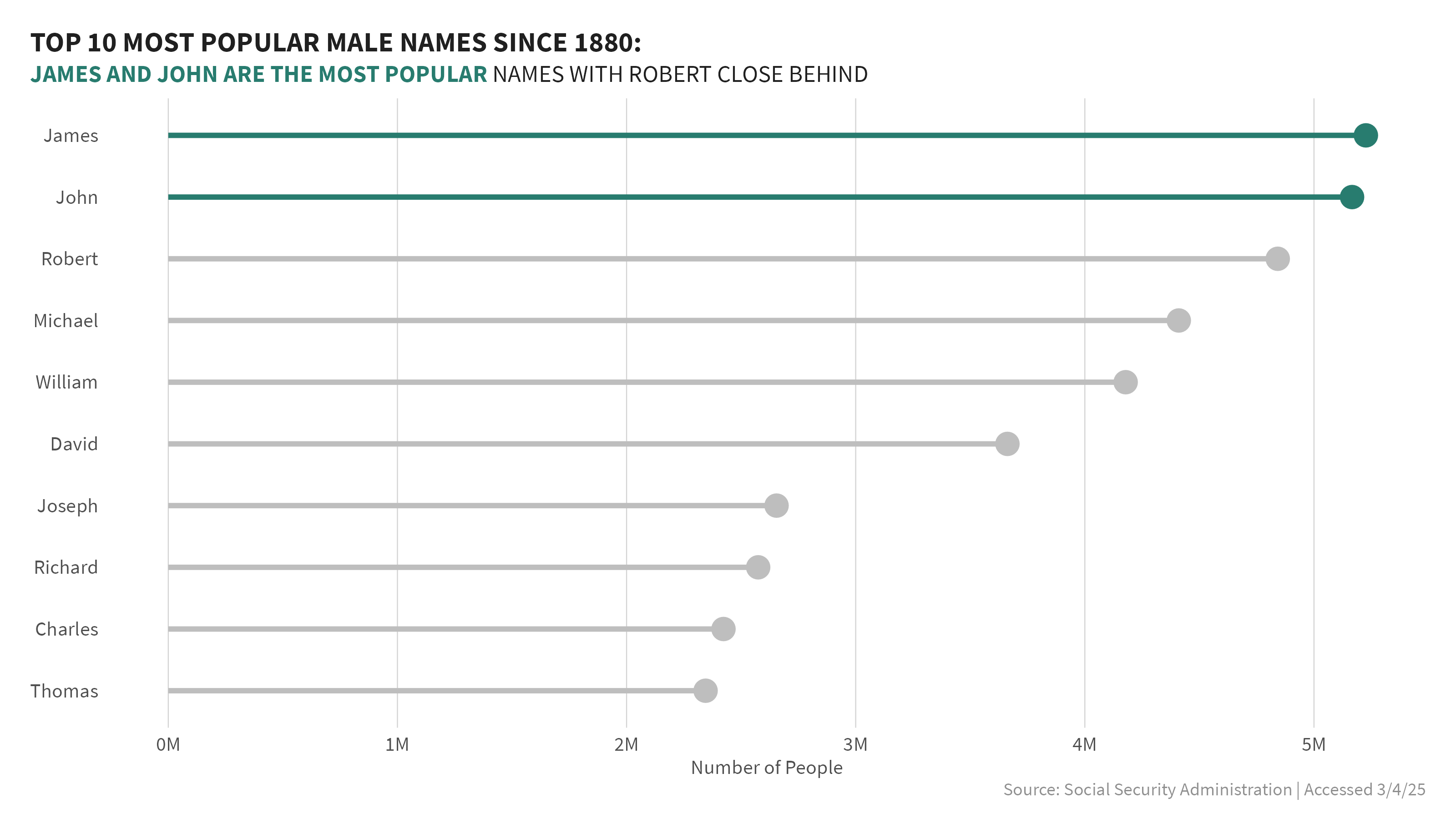
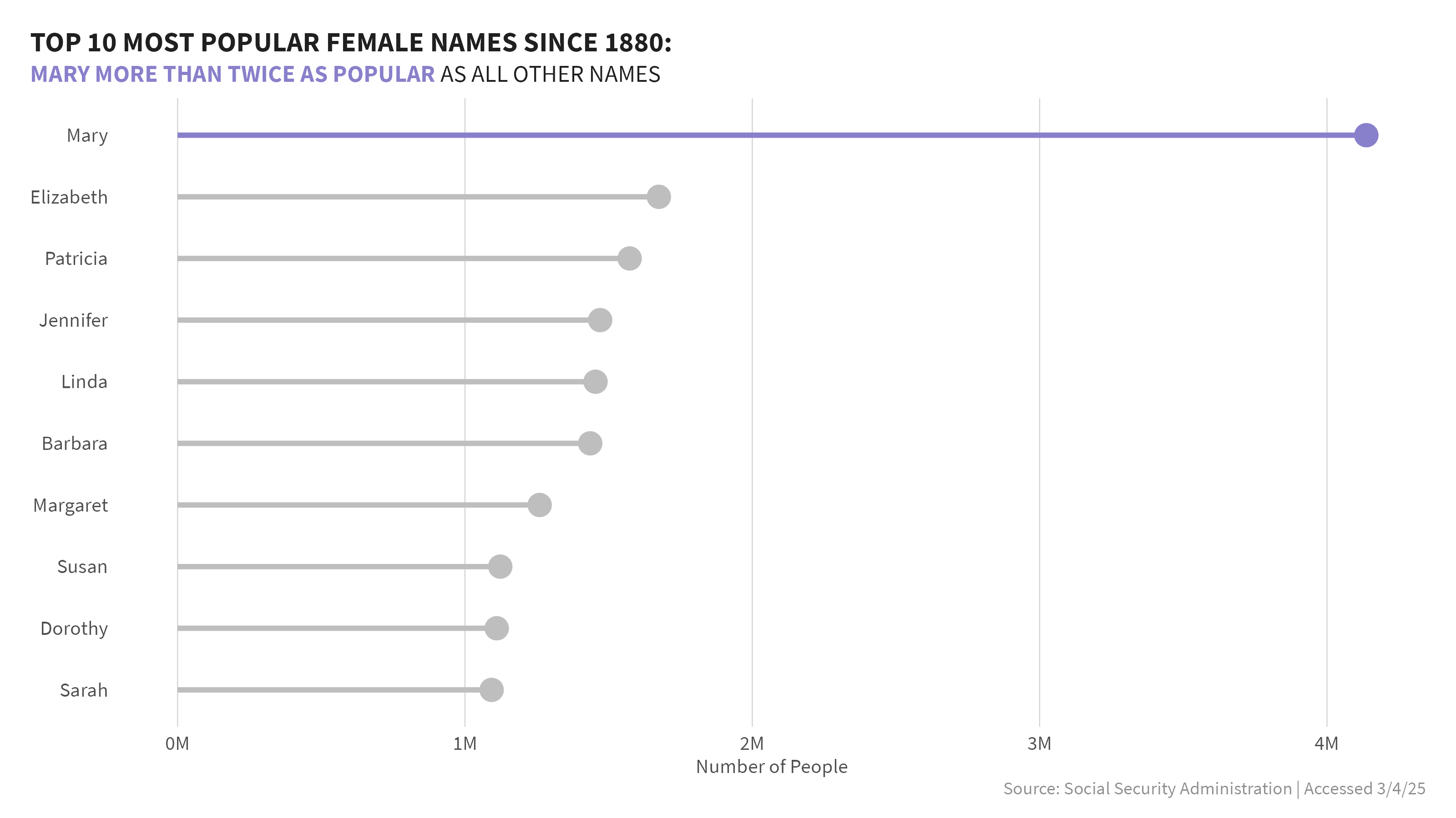
1. What are the top 10 most popular names overall by sex?
The first question that came to mind, was what were the most popular names over the past 140+ years? I looked at data separately by sex. Within each sex, I grouped the data by name and added a column for rank to rank the names by popularity and visualized the top 10 overall. For males, James and John took the top spots, though there were some close contenders. Whereas, for females, Mary was far and above the most popular name from 1880-2023 - more than 2.5x more popular than any other name.
2. When did the top names gain their popularity?
Curiousity then took me down the path of the question of popularity over time. When did these names become popular and did their popularity grow and wane?
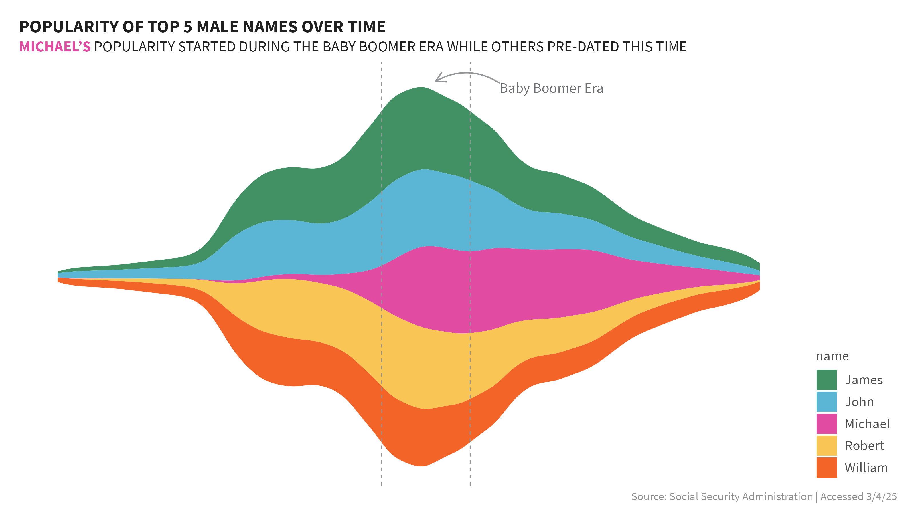
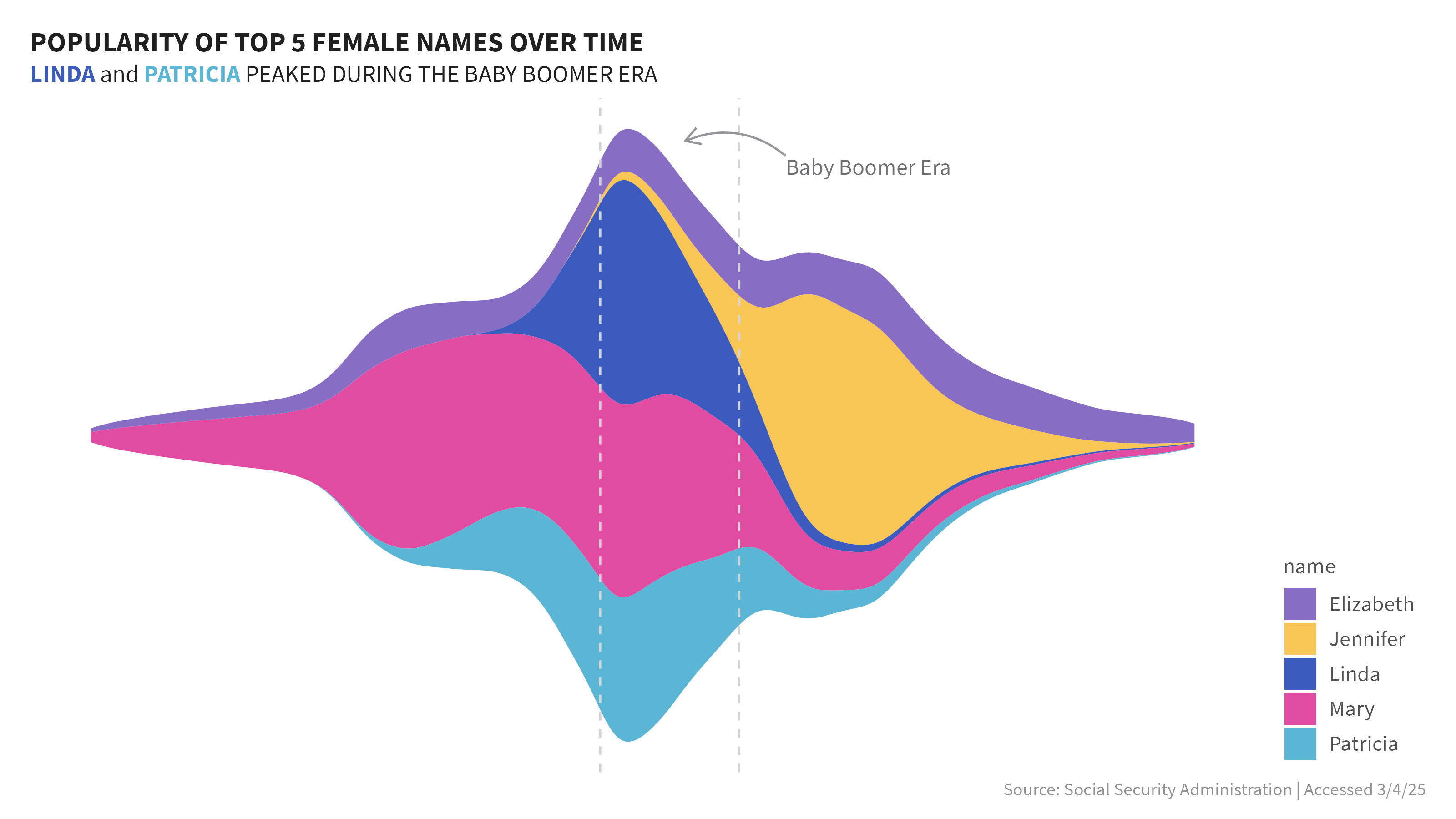
I started with a streamchart which can be useful to show the relative proportion of different categories over time, rather than focusing on exact values. They can elucidate how these categories change over time and help identify overall trends and patterns. The vertical demension does not indicate if a value is positive or negative.
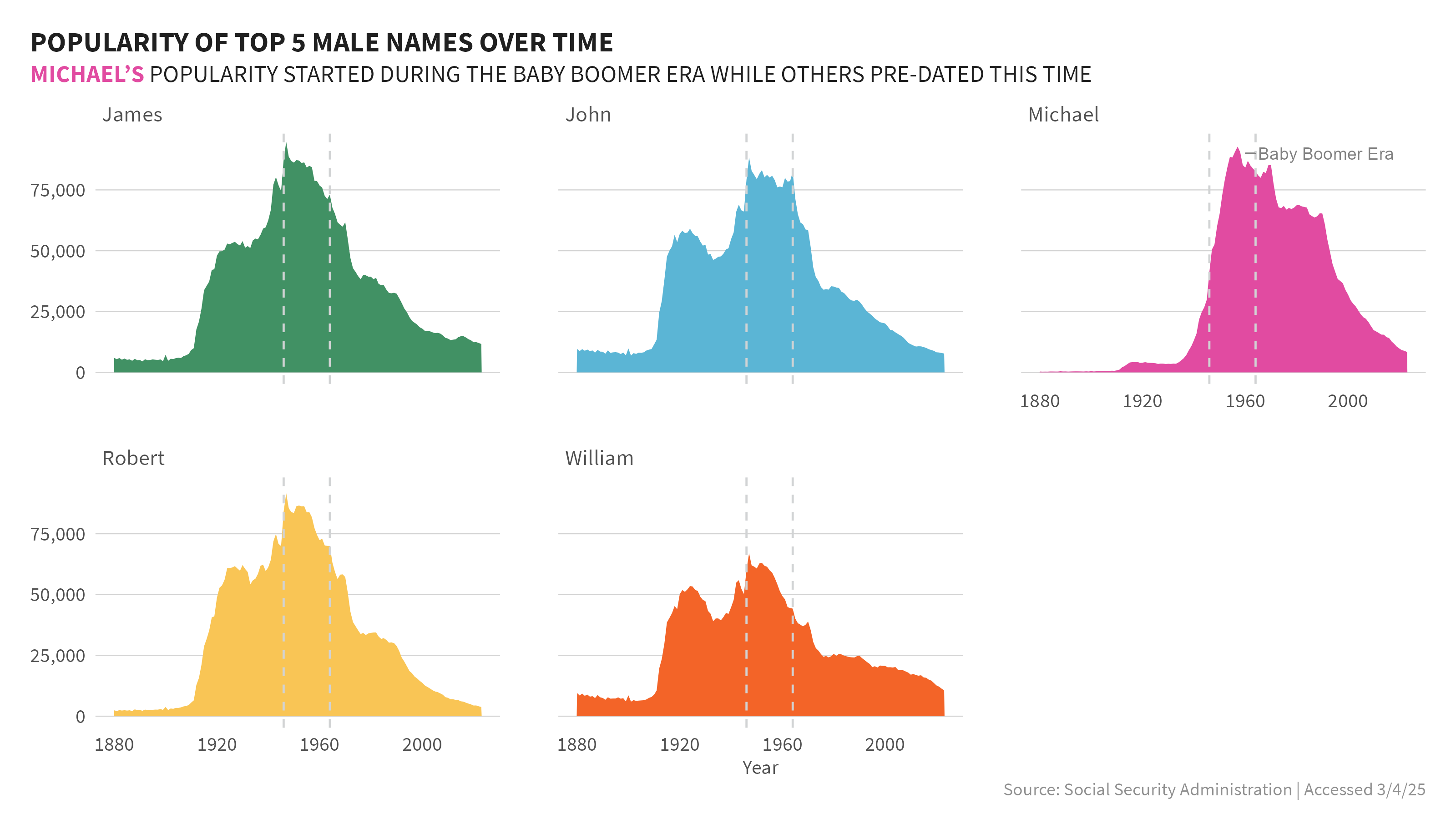
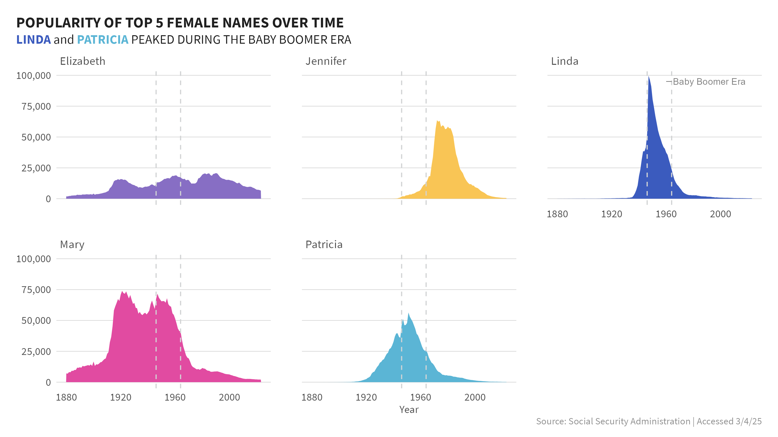
To keep things manageable I used the top 5 names overall for each sex, and then compared those names over time. When I first saw the graphic I saw a very obvious peak in the data and surmised this was the baby boomer era. I looked up the generally accepted dates of the baby boomer era and added vertical lines to indicate the start and stop of this period and annotated it in the graphs.
From the stream graphs, I could easily see the peaks and valleys of these 5 names relative to each other. Because the graph is focused on only 5 names per sex, it does not show the popularity of these names vs all others year on year. Just at glance I could glean a few things very quickly:
Males
- The name Michael seemed to have limited presence prior to the baby boomer era, when it really took off in popularity.
- Other male top 5 names appear to have experienced similar peaks and valleys in their popularity over time.
Females
- Elizabeth appeared to have relative stable proportion of occurences over the full time period.
- Linda and Patricia’s popularity really peaked in the baby boomer time period. Outside of this era, Linda had relatively low populartity.
- Mary had a steady presence predating the baby boomer era.
- Jennifer’s popularity didn’t really take off until after the baby boomer era.
3. When did the top names gain their popularity? - Revisualized!
While the stream graphs allowed me to at glance pick up key trends and patterns across the top 5 names per sex, I wanted to hone in on each name individually for greater detail so I decided to show the trend for each name and facet the viz by name allowing me to use a small multiples approach.